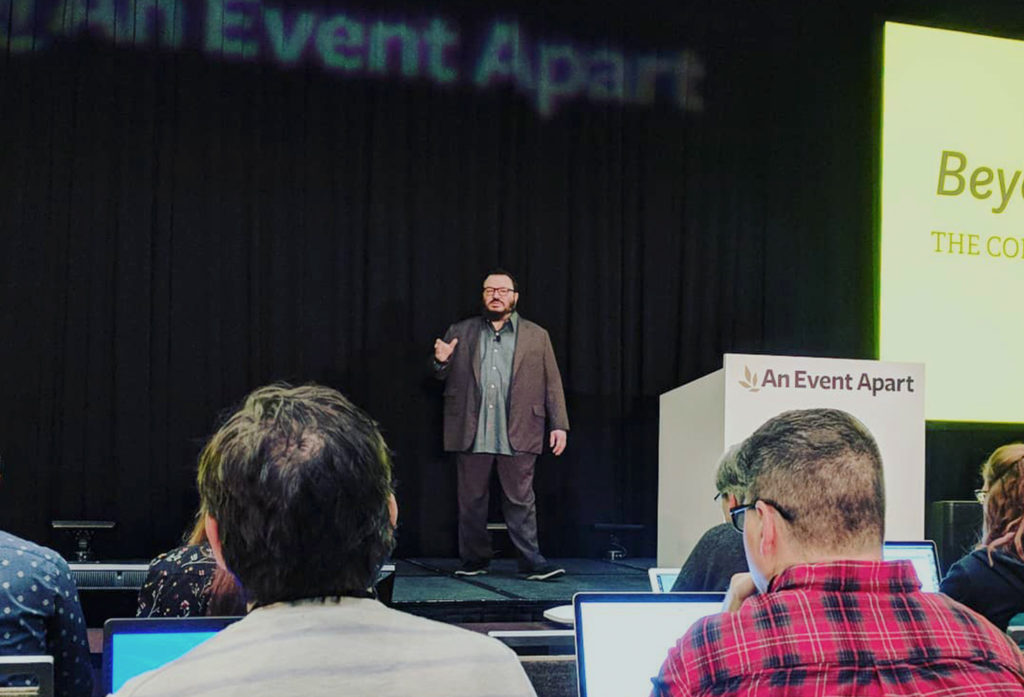
Elevated was excited to attend “An Event Apart” recently, and is sharing the wealth with key UX takeaways and quotes from the event.
Event Overview: Spawning from the blog and book series “A List Apart”, “An Event Apart” is a quarterly conference bringing together industry leaders for three days of design & code. Ranging from theory and big-picture based ideas about the present and future of our industry, to hands on presentations about new technologies like variable web fonts and CSS grid the talks aimed to deliver heaps of design & dev knowledge in hour sized chunks. If this sounds like your cup of tea, then you’re in the right spot to read on.
1. On designing to metrics:
“If content is delivered for the good of the general public or requires deep understanding, the design must facilitate a slowed experience. If it’s designed to promote a business/sale or to help a customer get an answer to her question, it must be designed for speed of relevancy.” – Jeffrey Zeldman, Founder & Creative Director, studio.zeldman
Great a-ha insights in regards to how we should think about designing when looking at engagement metrics. If you want a user to buy a product, yes you want them there quickly, but a ‘fast & frictionless’ metric shouldn’t always apply to experiences that require deeper engagement for a full understanding of information. Many of us are guilty of “reading” the news only by skimming a headline or subhead — and then relaying that information to our peers as if understood. This is actually a disservice to the goal of that content and the person you’re passing that information along to. The mentality of speed goes hand and hand with the technological renaissance the world has been experiencing, but according to Jeffrey it is the duty of the designer to know when to slow us down for common good.
2. On design systems:
“Successful design patterns don’t exist in a vacuum. They solve specific problems, and they start with content and people.” – Yesenia Perez-Cruz, Senior Design Director of Vox Media
In the past few years we’ve had to design & build for a bigger range of devices and react rapidly to the fast change of technology. We’ve adopted modular, pattern driven design systems that help us create cohesive design and user experiences quickly, but these experiences often fail because the ‘system’ is defined in the UI design phase of a project as a visual system. Yesenia laid out many of her failures & successes in building the new design system for VOX media, and as quoted above, it came down to a few key things: A successful design system should be measured by how well the elements of the system come together to achieve the goals of a product, which are the goals of the business, content managers & user – not by how pretty the end result is.
3. On content strategy:
“Really understanding and respecting where the user is in their experience dictates how to use the correct voice and tone when talking to them. A brand voice needs an array of tones to cover different experiences on the customers journey.” – Kristina Halvorson, Founder and CEO, Brain Traffic
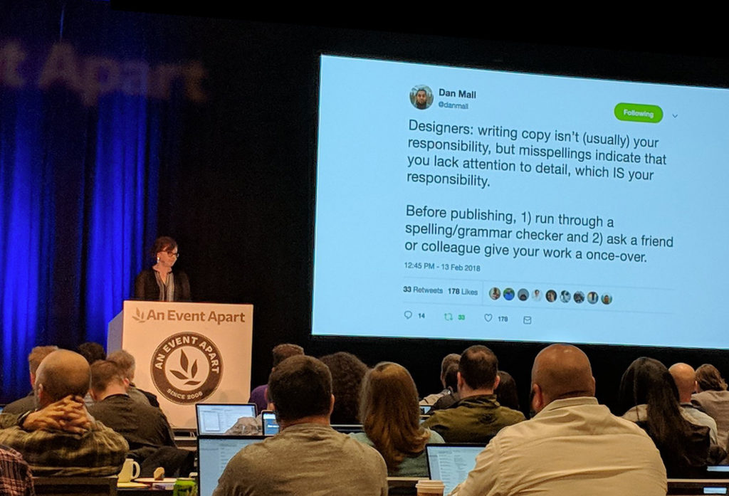
Content is king, so they say – and it’s a tough thing to get right. An eye opening position, held by Kirstina Halvorson, is too imagine the content voice in different stages of the customer journey and write creatively for each stage of that journey. We all use different tones of voice in our different experiences of our day-to-day, whether we’re speaking to friends or authority, or when speaking to someone in a certain mood – say happy vs angry. Too many brand guides and content writers simply say something along the lines of ‘we have a happy, positive brand voice’ when your user will not enjoy that tone when trying to figure out why something like their crockpot had lit on fire.
4. On user paths & navigation:
“Design for forward momentum. Design for unity. Design for the journeys customers are on, which often involves twins – an object and a subject. Design for minimalism and clarity. Be careful with images and icons. Words are always better, and the best words are tasks. Design for fidelity. A link is a promise & you keep your promise. ” – Gerry McGovern, CEO, Founder
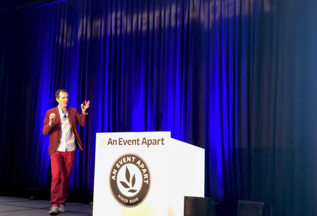
As was the theme of many conversations at An Event Apart Seattle, speediness & momentum for our users instantaneous expectations became a dominate topic of Gerry McGovern’s conversation about user paths and navigation, but so also did knowing when to slow down and design for focus. Something like a mega-navigation, especially in a mobile environment, is to a degree clutter to someone who already is a step or two in on their journey. When content tells a story correctly and a user is confident and moving along in their path we should be able to give them less and less information from the prior steps in their journey – so as to not have the opposite effect happen: for our user to get attracted by some ‘shiny’ links and deviate from a goal.
Photo Credit: Christopher Hincks
5. On designing & developing for performance:
“Every choice we make affects our users’ experience. We need to use only what we truly need in the age of speedy expectations. Make sure every resource has to fight for its place in our sites, and justify its existence. There are tradeoffs between design and performance. We should always strive to make our decisions in our user’s favor instead of in our own convenience. We should invest our time into these considerations so we can save the time for our users.” – Aaron Gustafson, Microsoft
Performance is an experience overlooked in the UX process, often left to to be thought about during the development process. At scale things like a slow-load time or page-load hierarchy can cost businesses great amounts of lost money. Aaron discussed some key trade offs, tasks and thoughts to be considered to increase performance at the cost of experience:
- Use native features whenever possible.
- Only include assets you actually need.
- Optimize ALL assets.
- Think about when and the order in which you load assets.
- Consider how you load assets.
- Only load assets when they actually add value to the user.
If you want to learn more, check out An Event Apart at https://aneventapart.com/, or feel free to contact us to chat about UX, digital design, SEO or internet marketing goodness. https://www.elevated.com/contact/