Cary Johnson
CEO
Sometimes it’s easier to identify what you don’t want.
That’s pretty much how Elevated started. With a few, very successful marketing professionals – who had built and managed agencies from small to large – were passionate about their craft, but turned off by the typical agency culture.
From the inside, that culture is a Churn & Burn, score and keep the account at any cost (to both the agency staff and to clients), experts-at-anything-and-everything, all about the billable hours approach.
Clients often end up locked into long-term contracts for services they don’t need and a team afraid to give voice to their expertise for fear of losing the account.
We knew what we didn’t want.
We set out to build an agency we’d like to hire and work for. It’s worked.
Almost six years later, we’ve seen excellent growth – primarily through client referrals. Most clients have stayed with us for more than two years. We’ve forged great partnerships and brought in like-minded, top talent. We’ve even collected some nice awards.
But as we reflected on all this, we realized something was missing. Our branding didn’t reflect who we are as an agency.
So, we drank our own KoolAid and embarked on a process we often prescribe for our clients.
The evolution in design & development for the latest release of elevated.com was in reaction to the necessary need for businesses to showcase their real selves – their values, their authentic (not idealized) culture, and their voice.
Patrick Dower, Senior UX/UI Design Lead, said it best:
The senior team at Elevated went through this great & necessary process to more closely define what Elevated’s values are how that flows into all aspects of the company. We had known for some time that we wanted a voice (tone & visually) that was more true to who we were – impactful, leaders, & authentic.
In early concept/visual design boards at this point of the project, we had some visual directions that reflected these ideas, but not until we started to own and live by the ‘real’ concept did the visual design direction have validation. From the visual side of the project, this was really the great first moment of collaboration and ‘aha’ of the project – the marrying of the brand concept and the visual design direction.
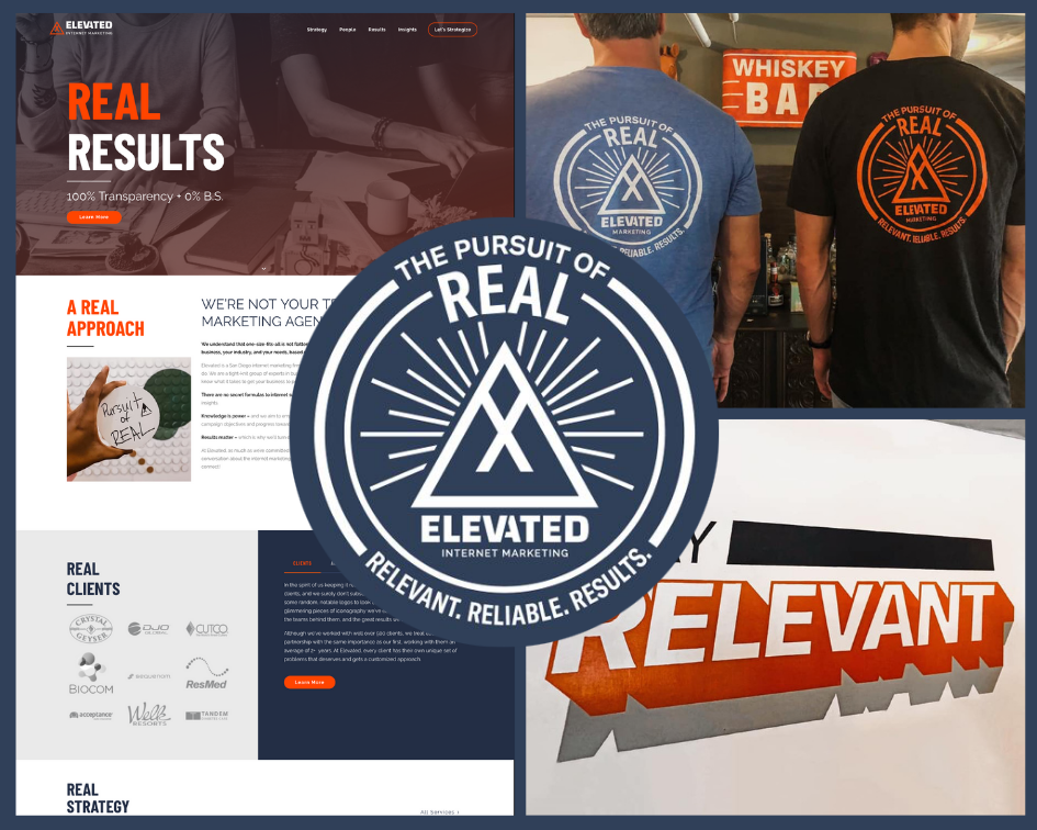
The design and our values started to resonate around what we now call “the four Rs”:
- Reliability – Be Reliable – Respond quickly, pick up the phone instead of an email, meet deadlines, deliver to expectations.
- Results – Results Driven – We are great at what we do but we don’t pretend that every result is going to be a home run. We set realistic expectations.
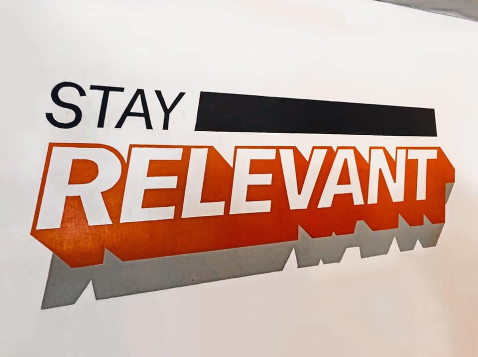
- Relevant – Stay Relevant – It seems like there is a new platform, technology, marketing channel every day. Our job is to make sure that we identify, test and share with our clients those we feel will best help them grow their business.
- Real – Be Real. We believe in 100% transparency and 0% B.S. We want to have real conversations and real relationships with our clients.
This process illuminated how we have evolved as an agency. It was time for our website to evolve as well.
Again, Patrick’s description of that process nails it:
To dial in on the specific visual direction and web/brand evolution now seen on the live site we initially started with researching visual and interface trends as well as performed benchmarking on our existing website. Based on our learnings from research and benchmarking and knowing the bones of our existing site were solid we strategized an evolutionary design approach.
Our visual design team collocated with all departments through the process to come up with what is seen today. Brand touchpoint-wise we produced an evolved digital-first color palette (as a digital-first business) that capitalized on screen-based color profiles (an evolution to our prior print-based palette) as well as a company values seal design to reflect our new mantras. This has branched out to in-office murals, shirts, hats and will continue to evolve on our touchpoints.
For the voice itself on the website we incorporated several new blocks that detailed the ‘real’ concept, integrated more culture photography, as well as tonally introduced the language in key locations like the navigation rollovers and headers to heavily push and repeat who we are as the user moves through the site.
As a result, this week, we released the latest iteration of Elevated.com. It’s not a re-brand or a massive overhaul. It’s an evolution of what we know works, but with our values and the prospective client’s ease of use front and center.
In this iteration, we cut a digital path for prospective clients. A more transparent look at how we work and how we have helped clients succeed. A filter to gauge if we are a good fit or not.
We aren’t a good fit for every client. When we see that, in the interest of the prospective client and our values, we do say, “No.”
Our best work thrives in collaborative partnerships with our clients’ marketing teams. We are here to do our best work and to see your business succeed.
No B.S.
Cary